Tank top logo placement is a crucial branding element, impacting visibility and style. Careful consideration of design,
fabric, and application method is key for effective results.
Understanding the Canvas: The Tank Top
Tank tops, seemingly simple garments, present unique challenges and opportunities for logo application. Unlike t-shirts, their minimal fabric offers limited real estate, demanding strategic placement. Consider the tank top’s style – racerback, classic, or muscle – as each impacts visual balance. Fabric type is also vital; smoother materials like cotton blends generally suit detailed designs, while textured fabrics may require bolder, simpler logos for readability.
The cut and fit influence how a logo appears on the body. A snug fit will stretch the design, potentially distorting it, whereas a looser fit allows for more relaxed placement. Understanding these nuances ensures the logo integrates seamlessly with the tank top’s form, enhancing both garment and brand identity.
Why Logo Placement Matters
Strategic logo placement on a tank top transcends mere aesthetics; it’s a powerful branding tool. Visibility is paramount – a well-placed logo captures attention and reinforces brand recognition. Placement dictates the perceived value and style; a central chest logo conveys boldness, while a subtle left-chest placement suggests sophistication.
Consider the target audience and intended message. Activewear benefits from functional placements that don’t impede movement, while fashion-focused designs prioritize visual impact. Poor placement can diminish brand impact, appearing awkward or unprofessional. Thoughtful placement maximizes logo exposure, turning wearers into walking advertisements and strengthening brand identity with every wear.
Key Areas for Logo Application
Prime tank top real estate includes the chest, back, and sleeves. Each location offers unique branding opportunities, impacting visibility and overall aesthetic appeal.
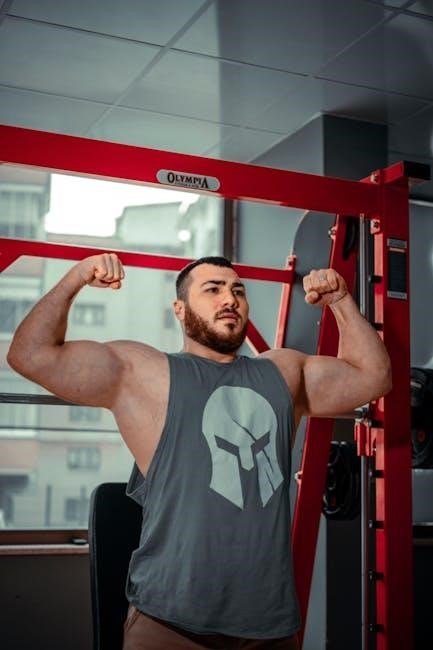
Chest Placement: Classic & Bold
Chest placement remains the most traditional and impactful area for tank top logos. It offers maximum visibility, making it ideal for brands aiming for a strong, immediate presence. A centrally located logo creates a balanced and authoritative look, perfect for athletic brands or those wanting to project confidence.
However, chest placement requires careful consideration of logo size. An overly large logo can appear aggressive or overwhelming, while a too-small logo might get lost. The design should complement the tank top’s cut and fabric. Bold designs work well on solid colors, while simpler logos may be better suited for patterned tanks. This placement is excellent for showcasing brand identity directly.
Left Chest vs. Right Chest – Subtle Differences
While seemingly minor, the choice between left or right chest logo placement can subtly influence perception. Traditionally, the left chest is favored, mirroring the placement of a pocket and feeling more natural to the eye. It’s often perceived as more professional and understated, suitable for corporate or team branding.
Conversely, right chest placement offers a slightly more modern and unique aesthetic. It can help a logo stand out without being overly assertive. This option is particularly effective for brands targeting a younger demographic or seeking a less conventional look. Consider the wearer’s dominant hand – a logo on the opposite side might receive more visual attention during movement. Ultimately, the best choice depends on the brand’s overall image and desired impact.
Center Chest: Making a Statement
Center chest logo placement is ideal for brands aiming for maximum visibility and impact. This position commands attention, making it perfect for bold designs and prominent branding. It’s a classic choice for athletic teams, promotional events, or any situation where brand recognition is paramount.
However, a large, centrally placed logo requires careful consideration of size and scale. An overly large design can appear overwhelming, while a too-small logo might get lost. Ensure the design complements the tank top’s style and fabric. This placement works exceptionally well with simpler logos or impactful graphics, creating a strong and memorable visual statement;
Off-Center Chest: Modern & Unique
Off-center chest logo placement offers a contemporary and distinctive aesthetic, moving away from traditional branding approaches. Positioning the logo to the side – either left or right – creates a more relaxed and fashionable look. This is particularly effective for brands targeting a younger demographic or those seeking a more artistic vibe.
This placement allows for creative design opportunities, potentially incorporating the logo into the tank top’s cut and drape. It’s ideal for smaller, more subtle logos or designs that benefit from negative space. Consider the wearer’s movement; an off-center logo can add visual interest as they move, but ensure it remains legible and balanced.

Alternative Placement Options
Beyond the chest, explore back, sleeve, and shoulder placements for unique branding. These areas offer subtle yet impactful opportunities to showcase your logo.
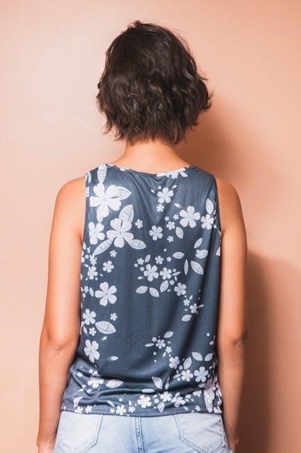
Back Placement: A Hidden Detail
Back logo placement offers a more understated branding approach, revealing the design when the wearer moves or is viewed from behind. This can create a sense of discovery and exclusivity. Consider the size and position carefully; a larger logo across the upper back makes a bolder statement, while a smaller logo at the nape of the neck provides a subtle touch.
Upper back placement is generally more visible, especially on fitted tank tops, and is ideal for designs you want to be noticed occasionally. Lower back placement, below the shoulders, is more discreet and can be a good option for minimalist logos or designs that complement the tank top’s cut. Think about how the logo will look when the tank top is worn and potentially layered under other clothing.
Upper Back vs. Lower Back – Visibility Considerations
Logo visibility dramatically shifts between upper and lower back placements on a tank top. The upper back, spanning the shoulder blades, benefits from greater immediate visibility, particularly with fitted styles. This area is ideal for designs intended to be frequently seen during movement or from a distance.
Conversely, the lower back, positioned below the shoulder blades and closer to the waistline, offers a more subtle and concealed placement. This is perfect for minimalist designs or logos intended as a ‘hidden’ detail, revealed only with specific movements or angles. Consider the tank top’s length and cut; longer tanks may obscure lower back logos more effectively. Ultimately, the choice depends on the desired level of brand exposure.
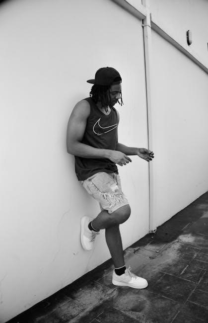
Sleeve Placement: Subtle Branding
Sleeve logo placement on tank tops offers a refined, understated branding opportunity. Typically, logos are positioned on the upper arm, utilizing the relatively flat surface. This approach is ideal for brands seeking a minimalist aesthetic, avoiding overly aggressive displays. The size of the logo should be carefully considered; larger designs can appear bulky and disrupt the tank top’s silhouette.
Sleeve placement works particularly well for athletic or performance tank tops, where a subtle brand identifier complements the overall design. It’s also effective for logos that benefit from repeated visibility during arm movements. Consider the sleeve’s width and length when determining optimal placement and size for maximum impact without compromising comfort or style.
Shoulder Placement: A Niche Look
Shoulder logo placement on tank tops represents a less conventional, more fashion-forward branding strategy. This area is best suited for smaller, streamlined logos or design elements, as the shoulder offers limited space. Placement can be on one shoulder, both, or extending slightly onto the upper chest for a unique visual effect. It’s a great option for brands aiming for a distinctive, edgy aesthetic.
Consider the tank top’s strap width and style when planning shoulder placement. Wider straps provide more surface area, while thinner straps require a more delicate logo application. This placement is often favored by athletic wear brands or those targeting a younger demographic, offering a subtle yet noticeable brand identifier.
Design Considerations for Placement
Logo design for tank tops requires careful attention to size, font, and color contrast with the fabric. Readability and visual impact are paramount for success.
Logo Size & Scale Relative to Placement
Determining the ideal logo size is vital for a balanced aesthetic. A chest placement generally accommodates larger logos, making a bold statement and maximizing visibility. Conversely, sleeve or shoulder placements necessitate smaller, more subtle designs to avoid overwhelming the garment.
Scale must also consider the tank top’s size range. A logo that appears proportionate on a medium may seem disproportionately large or small on an extra-small or extra-large size. Mockups are invaluable for visualizing how different sizes will translate across various sizes.
Avoid excessively large logos that distort the tank top’s shape or restrict movement. Prioritize legibility; intricate details can be lost if the logo is scaled down too much. Maintaining a harmonious relationship between logo size and placement ensures a professional and visually appealing result.
Font Choice & Readability
Selecting the right font is paramount for logo legibility, especially on a tank top’s often-dynamic surface. Bold, sans-serif fonts generally perform best, offering clarity even from a distance or during movement. Avoid overly ornate or thin fonts that can become illegible when reduced in size or applied to textured fabrics.
Consider the overall brand aesthetic. A modern brand might benefit from a clean, geometric font, while a vintage brand could utilize a more classic serif typeface. Ensure sufficient letter spacing (kerning) and line height (leading) to prevent characters from blurring together.
Test font choices on various tank top colors to guarantee adequate contrast. A dark font on a dark fabric will be difficult to read. Prioritize readability above all else; a beautiful font is useless if it cannot be easily deciphered.
Color Contrast & Tank Top Fabric
Color contrast is vital for logo visibility on tank tops. Dark logos pop on light fabrics, and vice versa. However, consider the specific fabric; a navy logo on a royal blue tank might lack sufficient contrast, appearing muddy. Utilize color wheels to identify complementary or contrasting color schemes.
Fabric texture also plays a role. A smooth, flat fabric allows for bolder color definition, while textured fabrics (like heathered materials) can soften colors. Test logo colors directly on the chosen fabric before committing to a large print run.
Be mindful of color bleeding, especially with lighter fabrics. Darker inks may show through. Always check for colorfastness to ensure the logo remains vibrant after washing.
Technical Aspects of Logo Application
Logo application techniques – screen printing, DTG, and heat transfer – each offer unique advantages regarding durability, cost, and design complexity for tank tops.
Screen Printing vs. Direct-to-Garment (DTG)
Screen printing excels for bulk orders, offering vibrant, long-lasting prints on tank tops, especially with fewer colors. It utilizes stencils and requires setup costs, making it less ideal for single items or complex designs. Direct-to-Garment (DTG), conversely, is perfect for intricate, full-color logos and small batches.
DTG prints directly onto the fabric, similar to an inkjet printer, eliminating setup fees. However, DTG prints may not be as durable as screen prints and can appear less vibrant on darker fabrics. The choice depends on order volume, design complexity, and desired longevity. Consider the tank top material; some fabrics work better with specific methods.
Heat Transfer Vinyl (HTV) – Pros & Cons
Heat Transfer Vinyl (HTV) is a versatile option for customizing tank tops, particularly for smaller runs or personalized designs. It involves cutting designs from vinyl sheets and applying them with heat. A significant pro is its affordability and ease of use, requiring minimal equipment – just a cutter and a heat press.
However, HTV has limitations. Cons include potential for peeling or cracking over time, especially with frequent washing. It’s also less breathable than screen printing or DTG. Complex designs with intricate details can be challenging to weed. HTV is best suited for simpler logos and designs on tank tops that won’t undergo heavy wear and tear.
Embroidery: Premium & Durable
Embroidery represents a premium and highly durable method for tank top logo application, offering a sophisticated, textured look. This technique involves stitching the logo directly onto the fabric, resulting in a long-lasting and professional finish. A key pro is its exceptional durability – embroidered logos withstand numerous washes and wear cycles without significant fading or deterioration.
However, cons include higher costs compared to other methods like screen printing or HTV, and limitations in design complexity. Fine details and gradients are difficult to replicate accurately with embroidery. It’s ideal for bolder, simpler logos on tank tops where a high-quality, lasting impression is desired, often favored for athletic wear or corporate branding.
Trends in Tank Top Logo Placement (2026)
In 2026, minimalist placements and oversized, bold designs will dominate tank top logos, reflecting a shift towards both subtlety and impactful branding statements.
Minimalist Logo Placement
Minimalist logo placement is gaining traction, emphasizing understated elegance and brand recognition through subtlety. This trend favors smaller logo sizes, often positioned on the left chest or upper back, offering a refined aesthetic.
The focus shifts from overwhelming displays to a quiet confidence, allowing the garment’s cut and fabric to complement the branding. Color choices lean towards tonal variations or muted palettes, blending seamlessly with the tank top’s material.
This approach appeals to consumers seeking a sophisticated look, valuing quality over ostentation. It’s particularly effective for brands aiming to project an image of exclusivity and timeless style, creating a lasting impression without being overly assertive.
Oversized & Bold Logo Designs
Oversized and bold logo designs are making a powerful statement in tank top branding, reflecting a trend towards maximalism and self-expression. These designs often dominate the chest area, utilizing large-scale graphics and vibrant colors to command attention.
This approach is ideal for brands seeking high visibility and a youthful, energetic image. Placement typically centers on the chest, creating a focal point that instantly communicates brand identity.

Successful execution requires careful consideration of logo proportions and fabric compatibility. Bold designs work best on simpler tank top styles, avoiding clashes with intricate patterns. The goal is impact – a confident, unapologetic display of brand presence.
Tools & Resources for Planning
Utilize mockup generators and professional design software to visualize logo placement. Partnering with experienced printing services ensures quality and accuracy.
Mockup Generators & Design Software
Visualizing your logo on a tank top before production is invaluable. Mockup generators, like Placeit or Designhill, allow you to upload your artwork and see it realistically applied to various tank top styles and colors. This helps assess size, placement, and overall aesthetic impact.
For creating and refining the logo itself, professional design software is essential. Adobe Illustrator is industry standard for vector graphics, ensuring scalability without loss of quality. Alternatively, Affinity Designer offers a powerful and affordable option. Canva is a user-friendly choice for simpler designs, though it may have limitations for complex artwork. Experimenting with different software will help you achieve the desired look and prepare files correctly for your chosen printing method.
Professional Printing Services
Partnering with a reputable printing service is vital for a high-quality final product. Look for companies specializing in garment decoration, offering options like screen printing, DTG, and embroidery. Discuss your logo placement, fabric type, and desired print durability with their experts.
Experienced printers can advise on optimal ink choices for color vibrancy and wash resistance. They’ll also handle file preparation, ensuring your artwork meets their technical specifications. Request samples or proofs before committing to a large order to verify color accuracy and placement. Local print shops often provide personalized service and faster turnaround times, while larger online services may offer competitive pricing for bulk orders.